问题
假设高度已知,请写出三栏布局,左栏、右栏宽度300px,中间宽度自适应。
三栏布局本身不难,难的是“你能不能说清楚为什么这么写、有什么坑、还有哪些替代方案”。
面试爱问这题也很现实:它覆盖了 float/定位/flex/table/grid 这些布局心智。只会写一种当然也能做出来页面,但遇到兼容性、内容高度变化、或者要做响应式的时候,就会暴露短板。
样式
下面是5种三栏布局的方法。
在写布局代码之前,先写两段公共的样式,此段写在头部。
1
2
3
4
5
6
7
8
9
10
| <style media="screen">
html *{
padding: 0;
margin: 0;
}
.layout article div{
min-height: 100px;
}
</style>
|
1. 浮动布局
1
2
3
4
5
6
7
8
9
10
11
12
13
14
15
16
17
18
19
20
21
22
23
24
25
26
27
28
|
<section class="layout float">
<style media="screen">
.layout.float .left{
float:left;
width:300px;
background: red;
}
.layout.float .center{
background: yellow;
}
.layout.float .right{
float:right;
width:300px;
background: blue;
}
</style>
<h1>三栏布局</h1>
<article class="left-right-center">
<div class="left"></div>
<div class="right"></div>
<div class="center">
<h2>浮动解决方案</h2>
1.这是三栏布局的浮动解决方案;
2.这是三栏布局的浮动解决方案;
</div>
</article>
</section>
|
浮动布局是有局限性的,浮动元素是脱离文档流,要做清除浮动,这个处理不好的话,会带来很多问题,比如高度塌陷等。
浮动布局的优点就是比较简单,兼容性也比较好。只要清除浮动做的好,是没有什么问题的。
延伸:你知道哪些清除浮动的方案?每种方案的有什么优缺点?
2.绝对定位布局
1
2
3
4
5
6
7
8
9
10
11
12
13
14
15
16
17
18
19
20
21
22
23
24
25
26
27
28
29
30
31
32
33
|
<section class="layout absolute">
<style>
.layout.absolute .left-center-right>div{
position: absolute;
}
.layout.absolute .left{
left:0;
width: 300px;
background: red;
}
.layout.absolute .center{
left: 300px;
right: 300px;
background: yellow;
}
.layout.absolute .right{
right:0;
width: 300px;
background: blue;
}
</style>
<h1>三栏布局</h1>
<article class="left-center-right">
<div class="left"></div>
<div class="center">
<h2>绝对定位解决方案</h2>
1.这是三栏布局的绝对定位解决方案;
2.这是三栏布局的绝对定位解决方案;
</div>
<div class="right"></div>
</article>
</section>
|
绝对定位布局优点,很快捷,设置很方便,而且也不容易出问题,你可以很快的就能想出这种布局方式。
缺点就是,绝对定位是脱离文档流的,意味着下面的所有子元素也会脱离文档流,这就导致了这种方法的有效性和可使用性是比较差的。
3.flex布局
1
2
3
4
5
6
7
8
9
10
11
12
13
14
15
16
17
18
19
20
21
22
23
24
25
26
27
28
29
30
31
32
33
|
<section class="layout flexbox">
<style>
.layout.flexbox{
margin-top: 110px;
}
.layout.flexbox .left-center-right{
display: flex;
}
.layout.flexbox .left{
width: 300px;
background: red;
}
.layout.flexbox .center{
flex:1;
background: yellow;
}
.layout.flexbox .right{
width: 300px;
background: blue;
}
</style>
<h1>三栏布局</h1>
<article class="left-center-right">
<div class="left"></div>
<div class="center">
<h2>flexbox解决方案</h2>
1.这是三栏布局的felx解决方案;
2.这是三栏布局的flex解决方案;
</div>
<div class="right"></div>
</article>
</section>
|
felxbox布局是css3里新出的一个,它就是为了解决上述两种方式的不足出现的,是比较完美的一个。目前移动端的布局也都是用flexbox。
flexbox 的缺点就是不能兼容 IE8 及以下浏览器(但现在大多数业务其实不用太担心这点)。
4.表格布局
1
2
3
4
5
6
7
8
9
10
11
12
13
14
15
16
17
18
19
20
21
22
23
24
25
26
27
28
29
30
31
32
33
34
|
<section class="layout table">
<style>
.layout.table .left-center-right{
width:100%;
height: 100px;
display: table;
}
.layout.table .left-center-right>div{
display: table-cell;
}
.layout.table .left{
width: 300px;
background: red;
}
.layout.table .center{
background: yellow;
}
.layout.table .right{
width: 300px;
background: blue;
}
</style>
<h1>三栏布局</h1>
<article class="left-center-right">
<div class="left"></div>
<div class="center">
<h2>表格布局解决方案</h2>
1.这是三栏布局的表格解决方案;
2.这是三栏布局的表格解决方案;
</div>
<div class="right"></div>
</article>
</section>
|
表格布局在历史上遭到很多人的摒弃,说表格布局麻烦,操作比较繁琐,其实这是一种误解,在很多场景中,表格布局还是很适用的,比如这个三栏布局,用表格布局就轻易写出来了。还有表格布局的兼容性很好,在flex布局不兼容的时候,可以尝试表格布局。
表格布局也是有缺陷的,当其中一个单元格高度超出的时候,两侧的单元格也是会跟着一起变高的,而有时候这种效果不是我们想要的。
5.网格布局
1
2
3
4
5
6
7
8
9
10
11
12
13
14
15
16
17
18
19
20
21
22
23
24
25
26
27
28
29
30
31
32
33
34
35
|
<section class="layout grid">
<style>
.layout.grid .left-center-right{
width:100%;
display: grid;
grid-template-rows: 100px;
grid-template-columns: 300px auto 300px;
}
.layout.grid .left-center-right>div{
}
.layout.grid .left{
width: 300px;
background: red;
}
.layout.grid .center{
background: yellow;
}
.layout.grid .right{
background: blue;
}
</style>
<h1>三栏布局</h1>
<article class="left-center-right">
<div class="left"></div>
<div class="center">
<h2>网格布局解决方案</h2>
1.这是三栏布局的网格布局解决方案;
2.这是三栏布局的网格布局解决方案;
</div>
<div class="right"></div>
</article>
</section>
|
网格布局(Grid)是更现代的一套方案,表达力很强,写三栏这种结构会很舒服。缺点也很现实:老旧浏览器兼容性需要你自己评估。
效果图
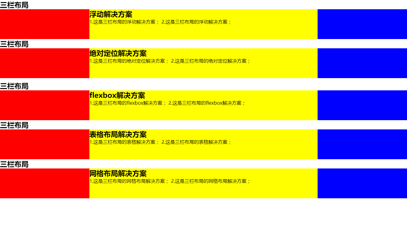
这五种解决方案应该是最常见的三栏布局,如果你还有其他的方案,欢迎补充!
最后这个问题还有很多延伸问题的,比如,
- 高度已知换为高度未知呢?
- 块内内容超出会是怎样的效果?
- 如果是上下高度已知,中间自适应呢?
- 如果是两栏布局呢?
- 如果是上下左右混合布局呢?
这些延伸问题其实是在考“布局思维”:高度未知、内容溢出、两栏/四栏变体、响应式切换……建议你至少把 flex 和 grid 两套思路练熟,日常写页面会省很多力。
欢迎补充!