深入理解 CSS 盒模型
前言
盒模型这题看起来“太基础”,但真要讲清楚,细节不少:box-sizing 影响宽高怎么算;margin 为啥会重叠;BFC 又是怎么一把解决一类布局问题的。
下面按几个常见问题把它捋一遍:
- 基本概念:标准模型 和IE模型
- CSS如何设置这两种模型
- JS如何设置获取盒模型对应的宽和高
- 实例题(根据盒模型解释边距重叠)
- BFC(边距重叠解决方案)
基本概念
盒模型的组成大家肯定都懂,由里向外content,padding,border,margin.
盒模型是有两种标准的,一个是标准模型,一个是IE模型。
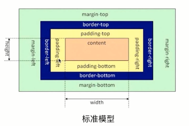
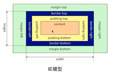
从上面两图不难看出在标准模型中,盒模型的宽高只是内容(content)的宽高,
而在IE模型中盒模型的宽高是内容(content)+填充(padding)+边框(border)的总宽高。
css如何设置两种模型
这里用到了CSS3 的属性 box-sizing
1 | /* 标准模型 */ |
JS获取宽高
通过JS获取盒模型对应的宽和高,有以下几种方法:
为了方便书写,以下用dom来表示获取的HTML的节点。
dom.style.width/height
这种方式只能取到dom元素内联样式所设置的宽高,也就是说如果该节点的样式是在style标签中或外联的CSS文件中设置的话,通过这种方法是获取不到dom的宽高的。
dom.currentStyle.width/height
这种方式获取的是在页面渲染完成后的结果,就是说不管是哪种方式设置的样式,都能获取到。但这种方式只有IE浏览器支持。window.getComputedStyle(dom).width/height
这种方式的原理和2是一样的,这个可以兼容更多的浏览器,通用性好一些。dom.getBoundingClientRect().width/height
这种方式是根据元素在视窗中的绝对位置来获取宽高的dom.offsetWidth/offsetHeight
这个就没什么好说的了,最常用的,也是兼容最好的。
边距重叠
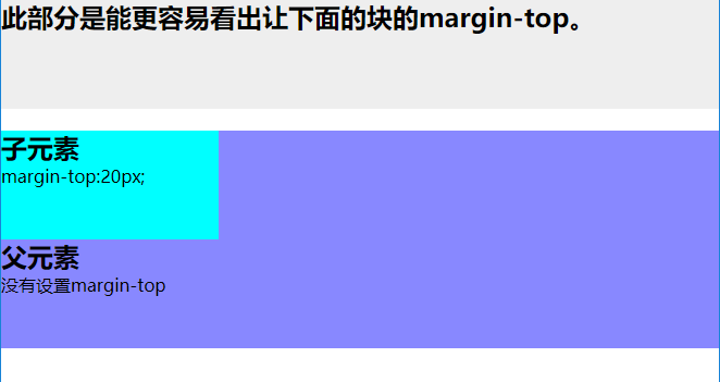
什么是边距重叠?
如下图,父元素没有设置margin-top,而子元素设置了margin-top:20px;可以看出,父元素也一起有了边距。
1 | <html lang="en"> |
边距重叠解决方案(BFC)
首先要明确BFC是什么意思,其全英文拼写为 Block Formatting Context 直译为”块级格式化上下文”
BFC的原理
- 内部的box会在垂直方向,一个接一个的放置
- 每个元素的 margin box 的左边,与包含块 border box 的左边相接触(对于从左往右的格式化,否则相反)
- box垂直方向的距离由margin决定,属于同一个bfc的两个相邻box的margin会发生重叠
- bfc的区域不会与浮动区域的box重叠
- bfc是一个页面上的独立的容器,外面的元素不会影响bfc里的元素,反过来,里面的也不会影响外面的
- 计算bfc高度的时候,浮动元素也会参与计算
怎么创建 BFC
- float属性不为none(脱离文档流)
- position为absolute或fixed
- display为inline-block,table-cell,table-caption,flex,inline-flex
- overflow不为visible
- 根元素
应用场景
- 自适应两栏布局
- 清除内部浮动
- 防止垂直margin重叠
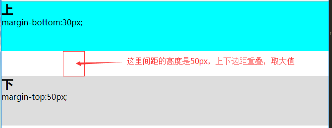
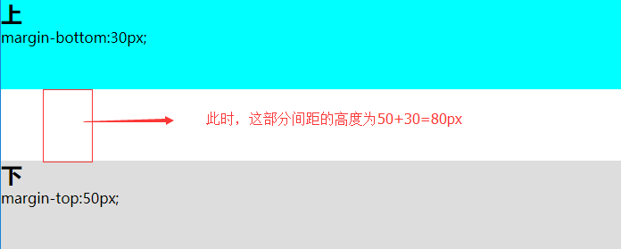
看一个垂直margin重叠例子
1 |
|
效果图
用bfc可以解决垂直margin重叠的问题
1 | <section class="top"> |
效果图
关于bfc的应用的案例这里就不在一一举出了,大家去网上找一些其他的文章看一下。
欢迎补充